The aqua color of the door represents emotional healing and protection.
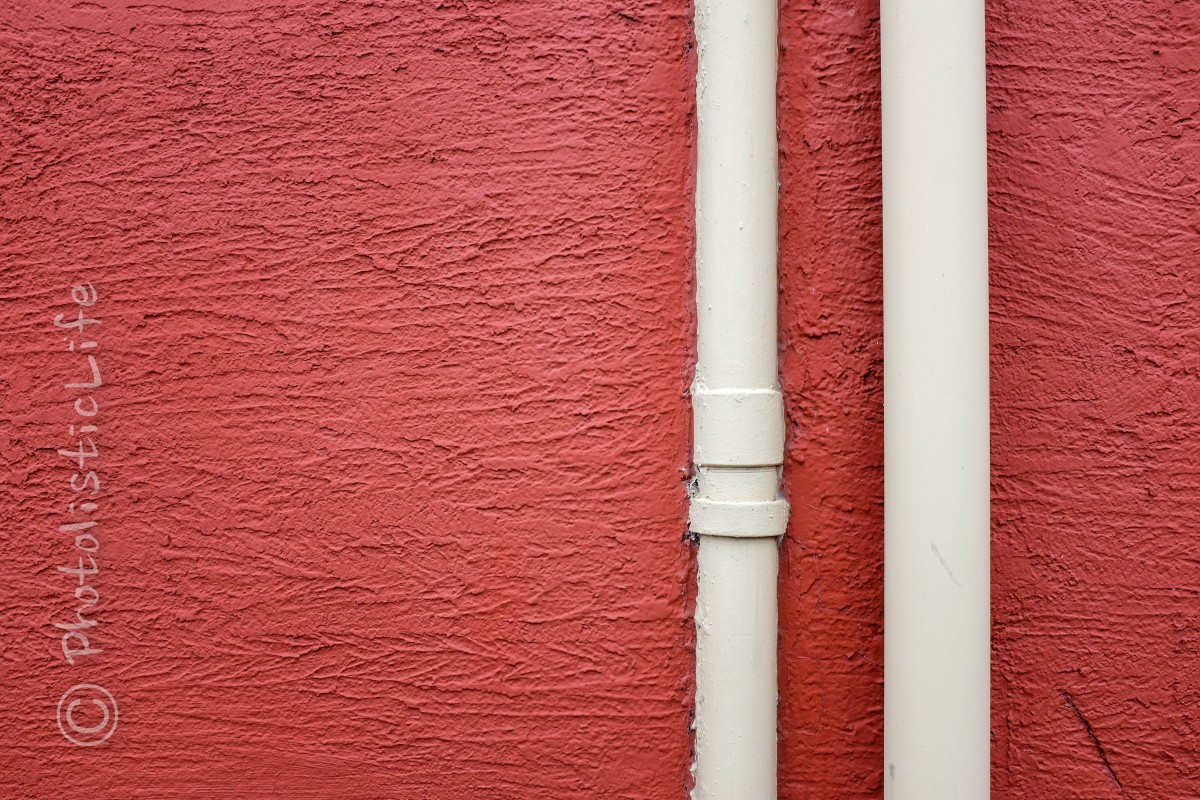
Color evokes a number of emotions in humans (unless you’re color blind… I’m sorry), it’s no wonder companies spend hundreds of thousands of dollars doing research to see what colors will influence potential customers to buy their products. For instance, the color red is used by many food companies based on extensive psychological studies. Scientists found that the color red makes people hungry, it catches our attention, increases our heart rate, and energizes us. I’m not saying if you photograph the color red someone will eat your photograph. I am saying that you can use colors in your photography to catch viewers attention and convey a feeling.
A quick search on the Google machine will result in hundreds of websites with lists of colors and the feelings they are meant to evoke. In theory this is a good resource but in practice you have to remember the example we used above. If you pick a color to evoke happiness but then then use it in a photograph of a small child crying you’ll make people sad or angry instead of happy. Seems like common sense right?
Here are a few colors and the feelings they are said to evoke…
Yellow: Joy, happiness, intellect, and energy.
Blue: Associated with depth and stability. It can evoke trust, loyalty, wisdom, confidence, intelligence, faith, and truth.
Black: Associated with power, elegance, formality, death, evil, and mystery.
Purple: Symbolizes power, nobility, luxury, and ambition.
Using bright colors in photographs has long been the tradition of photographers wanting to catch the eye of viewers but many have no idea what feelings the photograph will evoke until they get it home and actually take a long look at it. Do you give it much thought when your out and about with your camera?


