The use of color in photography can create dynamic images that grab viewers by the eye balls and convey all sorts of emotions. On the flip side, the improper use of color can create images that evoke a feeling of confusion, anxiety and/or look as if a clown exploded inside of the frame (some “HDR” images come to mind). Colors have the power of directing viewers attention to a point of interest or distracting viewers and rendering an image trite or befuddled.
The use of color in photography should be deliberate rather than a mere coincidence… Unless you’re color blind you see colors every day and subconsciously notice whether you like the mix of colors or not (ever walk into a home from the 1950’s and think “what were they thinking?” Chances are you weren’t a fan of their lime green, red, and yellow color scheme).
Want to know more about how color influences emotion? Check out this article on using colors effectively in composition.
Bringing your recognition of color to the forefront of your mind so you can use it to compose images is paramount to using color correctly. You see, you’re surrounded by colors all day, every day… Because of the vast number of color you see on any given day your mind has become desensitized to them. Sure, you see all of the colors (unless you’re color blind… Again, Sorry) but your mind doesn’t slow down and focus on them.
If you’re reading this thinking “what the heck, I notice every color I see” then you’re the minority. Congratulations, you color snob.
 Using color in composition can be difficult, just ask the hundreds of thousands of Street Photographers out there who only shoot in black and white (half will say something philosophical about it showing the soul of the subject and the other half will be honest and tell you it’s because it’s nearly impossible to avoid distracting colors in the background). How about landscape photographers shooting in the winter? I live in Pennsylvania and I can attest to the challenges that crop up when the colorful landscape turns to a dismal grey for four months out of the year.
Challenges
The argument that black and white photography eliminates distractions is a valid one, shooting in black and white creates a more uniform background that reduces distraction from the main subject. Color, on the other hand, can be difficult to predict. Landscape photography is a little easier to control because your landscape isn’t moving past you (unless you’re in a car, boat, airplane, or riding a giraffe). In situations where subjects are a fleeting moment, like Street Photography, you have little to no control over the colors around you or on your subject.
Not all colors play nicely with each other, some colors will clash and others will overtake the scene. You must find a visual balance between all of the colors in the photograph (read Creating Visual Balance In Photography). In a nutshell, some colors are “heavier” than others and you want to offset them by using other composition elements in the photograph to balance the photograph. With that being said, the content of the image can also offset any composition short-falling to a degree.
Effective Ways To Use Color
Contrast
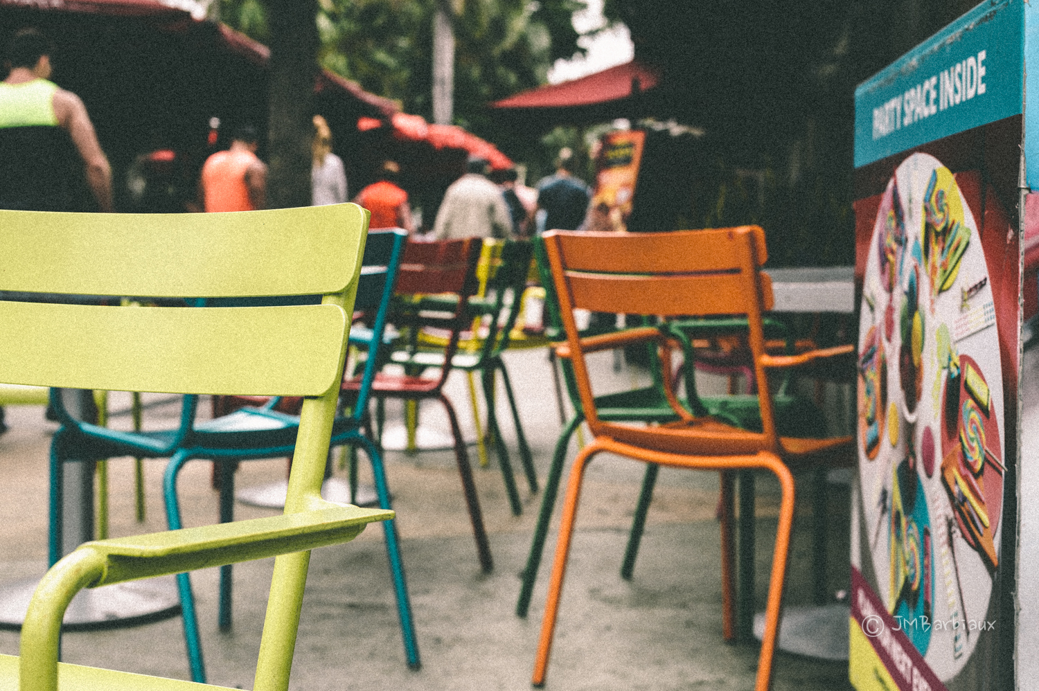
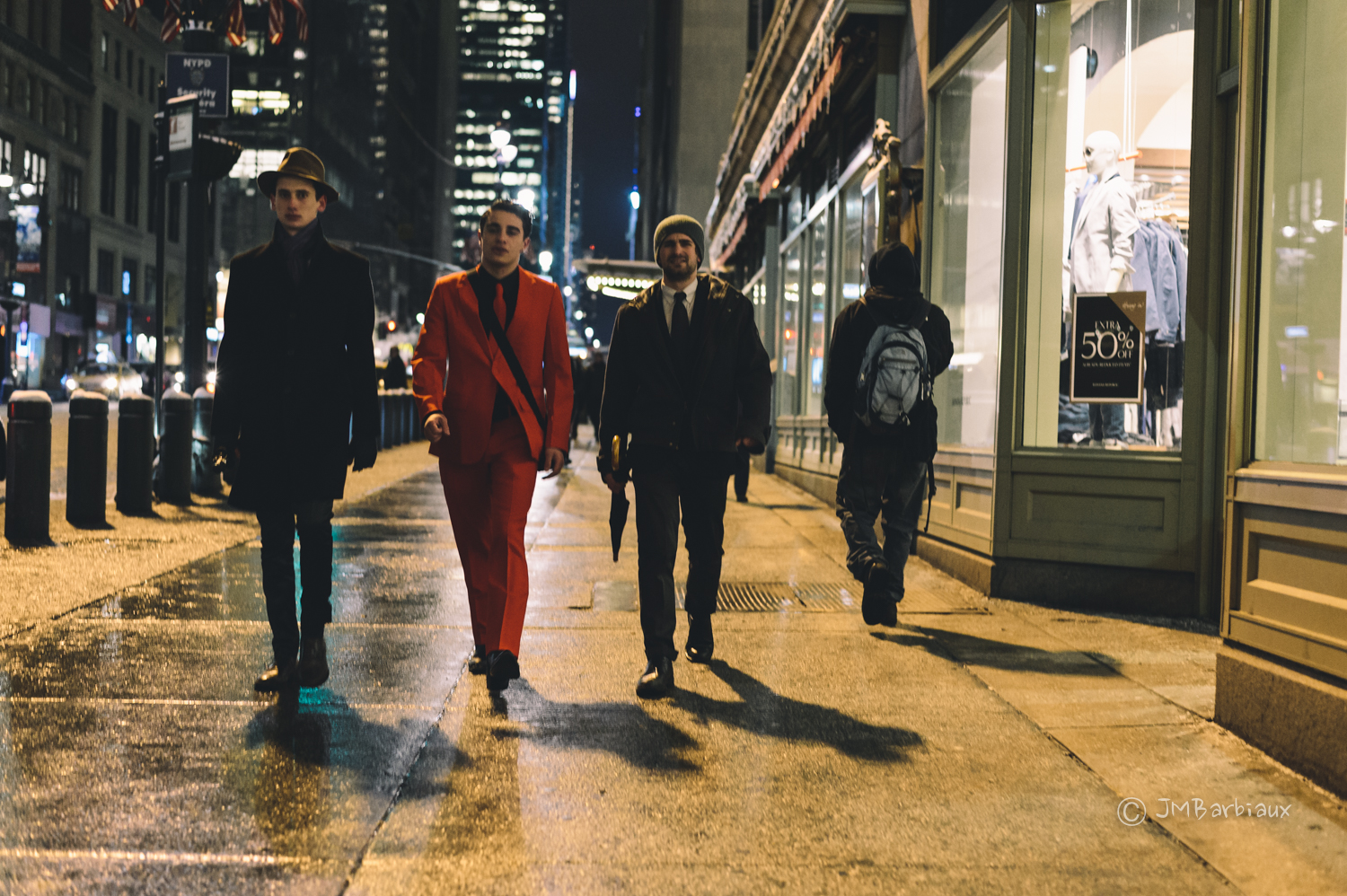
Colors that contrast with one another, like in the photograph at the top of the page, tend to catch viewers attention. Think about the age-old scene of a woman in a red dress against a sea of people in black or grey clothing. Yellow against a blue background, red against black, the contrast between these colors make images jump out at viewers.
 Light-trails are another great example of contrast. This photograph might be interesting without the light trails but it’s infinitely more interesting with the trails leading the viewer to the city.
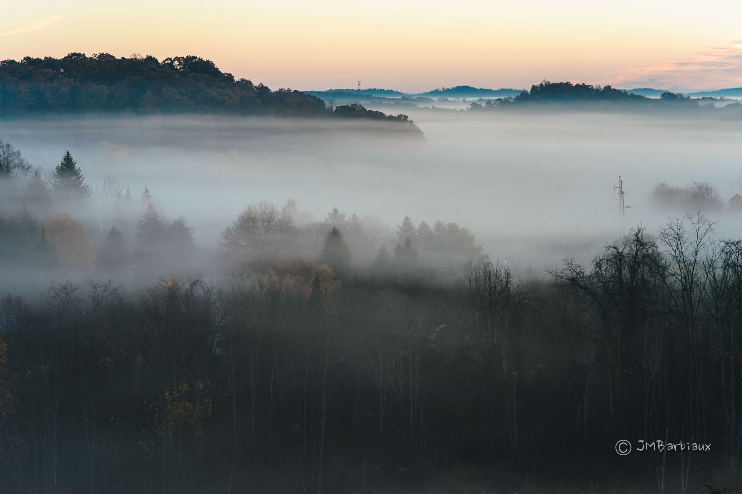 The small splotches of color in the foliage greatly enhance the photograph above, without them the photograph wouldn’t be as interesting in my opinion. The internet doesn’t do it as much justice but if you blow this image up full size you can see the sporadic yellow leafs in the front of the trees on the left side, they really pop in the image.

Isolation
Isolating a color, making it (or the subject wearing it) the main subject of your image, can be an effective way of using color in your photography. You can isolate color by using a telephoto lens and zooming in (the obvious way), you can open your aperture to blur the background so your subject is the only thing in focus, or you can use composition elements like leading lines and framing to do it. Whichever you choose, isolating color is a good way to eliminate distracting elements in the background.
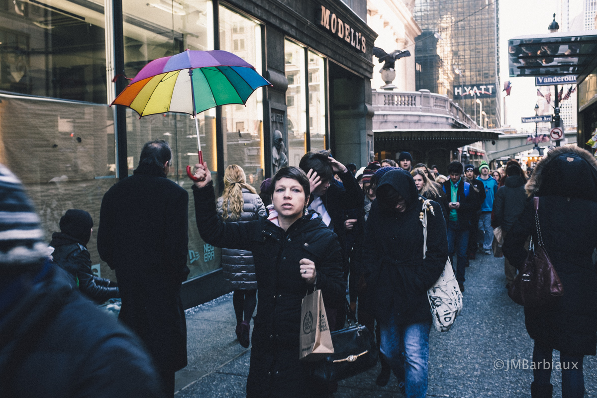 The image above would be incredibly boring without the woman holding the umbrella up… It’s infinitely more interesting because it’s not just one single color but a rainbow of colors. The difference between this and contrast is that there are plenty of similar colors in the image so had the umbrella not be placed where it is it may have been lost in the clutter of colors throughout the frame.
Complementary
Some colors complement one another, blue and orange, green and red, and so on… Read up on color theory for an eye-opening education on how to use color more effectively.
 Often, the way I determine whether or not to convert an image comes down to the color combinations that are found in the frame. If the colors work well together I will leave the image in color because it acts as another composition builder.
Balance
It’s worth noting that color can be used as an effective composition tool to balance out a photograph. Bright colors like red and yellow have more visual weight that your blues and greens (in most situations) and can be used to tip the scale in one direction or another when added to your images.
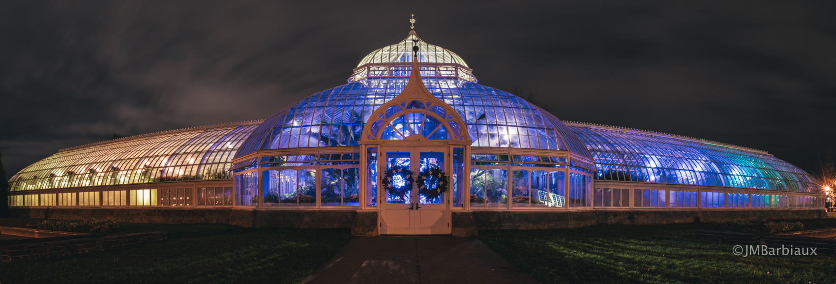
Though interesting, the panoramic image above is thrown a bit out of balance by the colors within it. To me, it looks as though a fish tank has been tipped to one side and all of the water has moved to the right. If the other side of the conservatory was lit up with colorful light as well this image would be much me appealing. With that being said, the image still works because of the interesting content… The building is rather unique looking on its own.
Do you ever contemplate the photographs you’re about to take? I’ll be the first to admit it is often difficult to slow my brain down and contemplate on the shots I’m about to take when I’m excited to start walking and looking for interesting moments. If you are new to photography or just want to take your photography to a higher level I would encourage you to stop and think about your shots before you take them. You’d be in the minority if you did, digital photography causes many photographers to spray and pray, capturing a plethora of mediocre photographs rather than a few great ones.
Stop. Think. Shoot. This can be the difference between “capturing” a photograph and “creating” a photograph. Try thinking of yourself as Bob Ross, creating a beautiful photograph with your camera as your brush… Rather than Rambo, spraying your enemies with thousands of frames per second.
Please feel free to leave your thoughts in the comments section below.